ORBIT-EO ideas
You are given a task to integrate an existing React component in the codebase
The codebase should support:
- shadcn project structure
- Tailwind CSS
- Typescript
If it doesn’t, provide instructions on how to setup project via shadcn CLI, install Tailwind or Typescript.
Determine the default path for components and styles.
If default path for components is not /components/ui, provide instructions on why it’s important to create this folder
Copy-paste this component to /components/ui folder:
spotlight-card.tsx
import React, { useEffect, useRef, ReactNode } from 'react';

interface GlowCardProps {
  children: ReactNode;
  className?: string;
  glowColor?: 'blue' | 'purple' | 'green' | 'red' | 'orange';
  size?: 'sm' | 'md' | 'lg';
  width?: string | number;
  height?: string | number;
  customSize?: boolean; // When true, ignores size prop and uses width/height or className
}

const glowColorMap = {
  blue: { base: 220, spread: 200 },
  purple: { base: 280, spread: 300 },
  green: { base: 120, spread: 200 },
  red: { base: 0, spread: 200 },
  orange: { base: 30, spread: 200 }
};

const sizeMap = {
  sm: 'w-48 h-64',
  md: 'w-64 h-80',
  lg: 'w-80 h-96'
};

const GlowCard: React.FC<GlowCardProps> = ({
  children,
  className = '',
  glowColor = 'blue',
  size = 'md',
  width,
  height,
  customSize = false
}) => {
  const cardRef = useRef<HTMLDivElement>(null);
  const innerRef = useRef<HTMLDivElement>(null);

  useEffect(() => {
    const syncPointer = (e: PointerEvent) => {
      const { clientX: x, clientY: y } = e;

      if (cardRef.current) {
        cardRef.current.style.setProperty('--x', x.toFixed(2));
        cardRef.current.style.setProperty('--xp', (x / window.innerWidth).toFixed(2));
        cardRef.current.style.setProperty('--y', y.toFixed(2));
        cardRef.current.style.setProperty('--yp', (y / window.innerHeight).toFixed(2));
      }
    };

    document.addEventListener('pointermove', syncPointer);
    return () => document.removeEventListener('pointermove', syncPointer);
  }, []);

  const { base, spread } = glowColorMap[glowColor];

  // Determine sizing
  const getSizeClasses = () => {
    if (customSize) {
      return ''; // Let className or inline styles handle sizing
    }
    return sizeMap[size];
  };

  const getInlineStyles = () => {
    const baseStyles = {
      '--base': base,
      '--spread': spread,
      '--radius': '14',
      '--border': '3',
      '--backdrop': 'hsl(0 0% 60% / 0.12)',
      '--backup-border': 'var(--backdrop)',
      '--size': '200',
      '--outer': '1',
      '--border-size': 'calc(var(--border, 2) * 1px)',
      '--spotlight-size': 'calc(var(--size, 150) * 1px)',
      '--hue': 'calc(var(--base) + (var(--xp, 0) * var(--spread, 0)))',
      backgroundImage: `radial-gradient(
        var(--spotlight-size) var(--spotlight-size) at
        calc(var(--x, 0) * 1px)
        calc(var(--y, 0) * 1px),
        hsl(var(--hue, 210) calc(var(--saturation, 100) * 1%) calc(var(--lightness, 70) * 1%) / var(--bg-spot-opacity, 0.1)), transparent
      )`,
      backgroundColor: 'var(--backdrop, transparent)',
      backgroundSize: 'calc(100% + (2 * var(--border-size))) calc(100% + (2 * var(--border-size)))',
      backgroundPosition: '50% 50%',
      backgroundAttachment: 'fixed',
      border: 'var(--border-size) solid var(--backup-border)',
      position: 'relative' as const,
      touchAction: 'none' as const,
    };

    // Add width and height if provided
    if (width !== undefined) {
      baseStyles.width = typeof width === 'number' ? `${width}px` : width;
    }
    if (height !== undefined) {
      baseStyles.height = typeof height === 'number' ? `${height}px` : height;
    }

    return baseStyles;
  };

  const beforeAfterStyles = `
    [data-glow]::before,
    [data-glow]::after {
      pointer-events: none;
      content: "";
      position: absolute;
      inset: calc(var(--border-size) * -1);
      border: var(--border-size) solid transparent;
      border-radius: calc(var(--radius) * 1px);
      background-attachment: fixed;
      background-size: calc(100% + (2 * var(--border-size))) calc(100% + (2 * var(--border-size)));
      background-repeat: no-repeat;
      background-position: 50% 50%;
      mask: linear-gradient(transparent, transparent), linear-gradient(white, white);
      mask-clip: padding-box, border-box;
      mask-composite: intersect;
    }

    [data-glow]::before {
      background-image: radial-gradient(
        calc(var(--spotlight-size) * 0.75) calc(var(--spotlight-size) * 0.75) at
        calc(var(--x, 0) * 1px)
        calc(var(--y, 0) * 1px),
        hsl(var(--hue, 210) calc(var(--saturation, 100) * 1%) calc(var(--lightness, 50) * 1%) / var(--border-spot-opacity, 1)), transparent 100%
      );
      filter: brightness(2);
    }

    [data-glow]::after {
      background-image: radial-gradient(
        calc(var(--spotlight-size) * 0.5) calc(var(--spotlight-size) * 0.5) at
        calc(var(--x, 0) * 1px)
        calc(var(--y, 0) * 1px),
        hsl(0 100% 100% / var(--border-light-opacity, 1)), transparent 100%
      );
    }

    [data-glow] [data-glow] {
      position: absolute;
      inset: 0;
      will-change: filter;
      opacity: var(--outer, 1);
      border-radius: calc(var(--radius) * 1px);
      border-width: calc(var(--border-size) * 20);
      filter: blur(calc(var(--border-size) * 10));
      background: none;
      pointer-events: none;
      border: none;
    }

    [data-glow] > [data-glow]::before {
      inset: -10px;
      border-width: 10px;
    }
  `;

  return (
    <>
      <style dangerouslySetInnerHTML={{ __html: beforeAfterStyles }} />
      <div
        ref={cardRef}
        data-glow
        style={getInlineStyles()}
        className={`
          ${getSizeClasses()}
          ${!customSize ? 'aspect-[3/4]' : ''}
          rounded-2xl
          relative
          grid
          grid-rows-[1fr_auto]
          shadow-[0_1rem_2rem_-1rem_black]
          p-4
          gap-4
          backdrop-blur-[5px]
          ${className}
        `}
      >
        <div ref={innerRef} data-glow></div>
        {children}
      </div>
    </>
  );
};

export { GlowCard }

demo.tsx
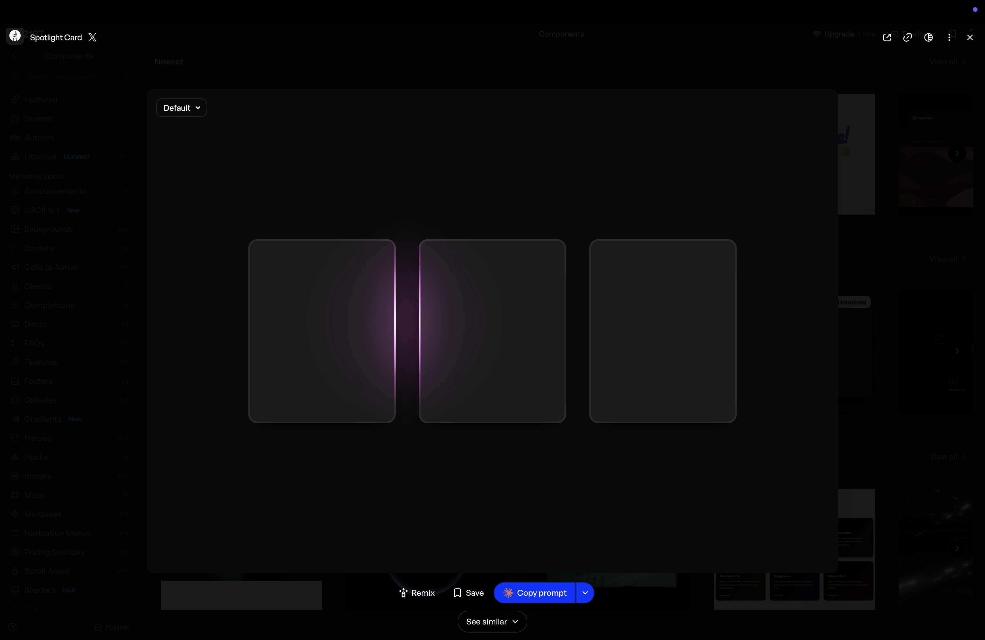
import { GlowCard } from "@/components/ui/spotlight-card";

export function Default(){
  return(
    <div className="w-screen h-screen flex flex-row items-center justify-center gap-10 custom-cursor">
      <GlowCard />
      <GlowCard />
      <GlowCard />
    </div>
  );
};
https://21st.dev/community/components?preview=%2F%40jahed%2Fcomponents%2Fspotlight-card