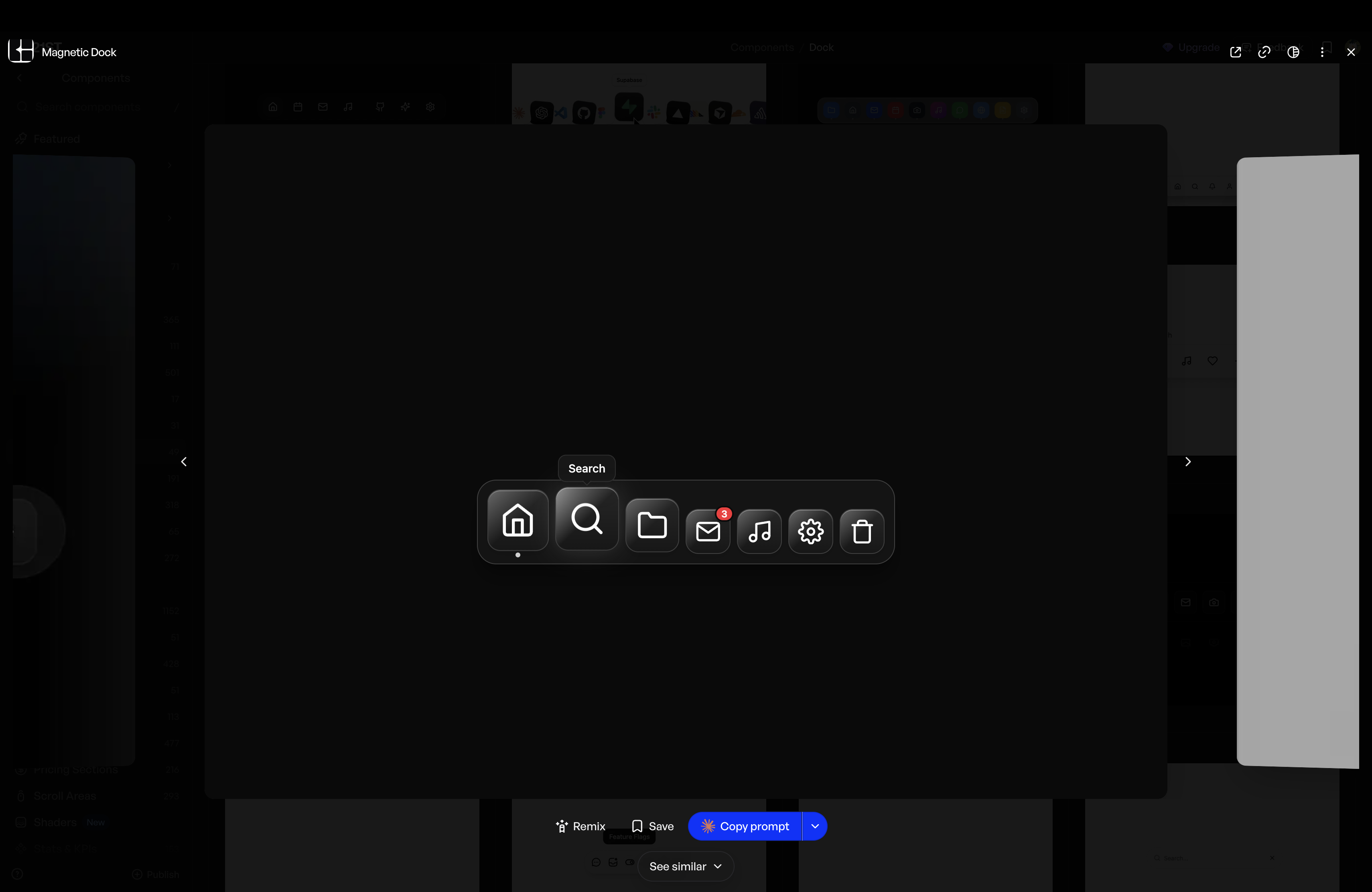
ORBIT-EO ideas
You are given a task to integrate an existing React component in the codebase
The codebase should support:
- shadcn project structure
- Tailwind CSS
- Typescript
If it doesn’t, provide instructions on how to setup project via shadcn CLI, install Tailwind or Typescript.
Determine the default path for components and styles.
If default path for components is not /components/ui, provide instructions on why it’s important to create this folder
Copy-paste this component to /components/ui folder:
magnetic-dock.tsx
"use client"

import * as React from "react"
import { motion, useMotionValue, useSpring, useTransform, AnimatePresence, type MotionValue } from "framer-motion"
import { cn } from "@/lib/utils"

interface MagneticDockProps {
    /** Array of dock items */
    items: DockItemData[]
    /** Size of icons in pixels */
    iconSize?: number
    /** Maximum scale on hover */
    maxScale?: number
    /** Distance of magnetic effect in pixels */
    magneticDistance?: number
    /** Show labels on hover */
    showLabels?: boolean
    /** Dock position */
    position?: "bottom" | "top" | "left" | "right"
    /** Background style */
    variant?: "glass" | "solid" | "transparent"
    /** Custom class name */
    className?: string
}

interface DockItemData {
    /** Unique identifier */
    id: string
    /** Display label */
    label: string
    /** Icon component or image URL */
    icon: React.ReactNode
    /** Click handler */
    onClick?: () => void
    /** Whether item is active */
    isActive?: boolean
    /** Badge count */
    badge?: number
}

interface DockItemProps {
    item: DockItemData
    mouseX: MotionValue<number>
    iconSize: number
    maxScale: number
    magneticDistance: number
    showLabels: boolean
    isVertical: boolean
}

function DockItem({
    item,
    mouseX,
    iconSize,
    maxScale,
    magneticDistance,
    showLabels,
    isVertical,
}: DockItemProps) {
    const ref = React.useRef<HTMLButtonElement>(null)
    const [isHovered, setIsHovered] = React.useState(false)

    // Calculate distance from mouse to center of item
    const distance = useTransform(mouseX, (val: number) => {
        if (!ref.current) return magneticDistance + 1
        const rect = ref.current.getBoundingClientRect()
        const center = isVertical
            ? rect.top + rect.height / 2
            : rect.left + rect.width / 2
        return val - center
    })

    // Scale based on distance - closer = larger
    const scale = useTransform(distance, [-magneticDistance, 0, magneticDistance], [1, maxScale, 1])

    // Apply spring physics for smooth animation
    const springConfig = { damping: 20, stiffness: 300, mass: 0.5 }
    const smoothScale = useSpring(scale, springConfig)

    // Calculate the size based on scale
    const size = useTransform(smoothScale, (s) => s * iconSize)

    // Floating effect
    const y = useTransform(smoothScale, (s) => (s - 1) * -10)
    const smoothY = useSpring(y, springConfig)

    return (
        <motion.button
            ref={ref}
            onClick={item.onClick}
            onMouseEnter={() => setIsHovered(true)}
            onMouseLeave={() => setIsHovered(false)}
            className={cn(
                "relative flex items-center justify-center",
                "rounded-2xl transition-colors duration-200",
                "focus:outline-none focus-visible:ring-2 focus-visible:ring-neutral-400 dark:focus-visible:ring-white/50",
                item.isActive && "bg-neutral-200/50 dark:bg-white/10"
            )}
            style={{
                width: size,
                height: size,
                y: isVertical ? 0 : smoothY,
                x: isVertical ? smoothY : 0,
            }}
            whileTap={{ scale: 0.9 }}
        >
            {/* Icon Container */}
            <motion.div
                className={cn(
                    "relative w-full h-full rounded-2xl overflow-hidden",
                    "bg-gradient-to-b from-neutral-100 to-neutral-50",
                    "dark:from-neutral-800 dark:to-neutral-900",
                    "backdrop-blur-sm",
                    "border border-neutral-300 dark:border-neutral-700",
                    "shadow-lg shadow-black/10 dark:shadow-black/30",
                    "flex items-center justify-center",
                    "transition-all duration-200"
                )}
                style={{
                    boxShadow: isHovered
                        ? "0 8px 32px rgba(0,0,0,0.15), inset 0 1px 0 rgba(255,255,255,0.5)"
                        : "0 4px 12px rgba(0,0,0,0.08), inset 0 1px 0 rgba(255,255,255,0.3)",
                }}
            >
                {/* Icon */}
                <div className="w-[60%] h-[60%] flex items-center justify-center text-neutral-700 dark:text-white">
                    {item.icon}
                </div>

                {/* Shine effect */}
                <motion.div
                    className="absolute inset-0 pointer-events-none"
                    style={{
                        background:
                            "linear-gradient(135deg, rgba(255,255,255,0.6) 0%, transparent 50%, transparent 100%)",
                        opacity: isHovered ? 0.9 : 0.5,
                    }}
                />
            </motion.div>

            {/* Badge */}
            <AnimatePresence>
                {item.badge !== undefined && item.badge > 0 && (
                    <motion.div
                        initial={{ scale: 0, opacity: 0 }}
                        animate={{ scale: 1, opacity: 1 }}
                        exit={{ scale: 0, opacity: 0 }}
                        className={cn(
                            "absolute -top-1 -right-1",
                            "min-w-[20px] h-5 px-1.5",
                            "rounded-full",
                            "bg-red-500",
                            "text-white text-xs font-semibold",
                            "flex items-center justify-center",
                            "border-2 border-white dark:border-neutral-950",
                            "shadow-lg"
                        )}
                    >
                        {item.badge > 99 ? "99+" : item.badge}
                    </motion.div>
                )}
            </AnimatePresence>

            {/* Active Indicator */}
            <AnimatePresence>
                {item.isActive && (
                    <motion.div
                        initial={{ scale: 0, opacity: 0 }}
                        animate={{ scale: 1, opacity: 1 }}
                        exit={{ scale: 0, opacity: 0 }}
                        className={cn(
                            "absolute -bottom-2",
                            "w-1.5 h-1.5 rounded-full",
                            "bg-neutral-600 dark:bg-white/80"
                        )}
                    />
                )}
            </AnimatePresence>

            {/* Tooltip */}
            <AnimatePresence>
                {showLabels && isHovered && (
                    <motion.div
                        initial={{ opacity: 0, y: 8, scale: 0.9 }}
                        animate={{ opacity: 1, y: 0, scale: 1 }}
                        exit={{ opacity: 0, y: 8, scale: 0.9 }}
                        transition={{ duration: 0.15, ease: "easeOut" }}
                        className={cn(
                            "absolute -top-10 left-1/2 -translate-x-1/2",
                            "px-3 py-1.5 rounded-lg",
                            "bg-white dark:bg-neutral-900/95",
                            "backdrop-blur-sm",
                            "text-neutral-800 dark:text-white text-sm font-medium whitespace-nowrap",
                            "border border-neutral-200 dark:border-white/10",
                            "shadow-xl shadow-black/10 dark:shadow-black/20",
                            "pointer-events-none z-50"
                        )}
                    >
                        {item.label}
                        {/* Tooltip arrow */}
                        <div
                            className={cn(
                                "absolute left-1/2 -translate-x-1/2 -bottom-1",
                                "w-2 h-2 rotate-45",
                                "bg-white dark:bg-neutral-900/95",
                                "border-r border-b border-neutral-200 dark:border-white/10"
                            )}
                        />
                    </motion.div>
                )}
            </AnimatePresence>

            {/* Hover glow */}
            <motion.div
                className="absolute inset-0 rounded-2xl pointer-events-none"
                animate={{
                    boxShadow: isHovered
                        ? "0 0 30px rgba(255,255,255,0.15)"
                        : "0 0 0px rgba(255,255,255,0)",
                }}
                transition={{ duration: 0.3 }}
            />
        </motion.button>
    )
}

function MagneticDock({
    items,
    iconSize = 56,
    maxScale = 1.5,
    magneticDistance = 150,
    showLabels = true,
    position = "bottom",
    variant = "glass",
    className,
}: MagneticDockProps) {
    const mousePosition = useMotionValue(Infinity)
    const isVertical = position === "left" || position === "right"

    const handleMouseMove = React.useCallback(
        (e: React.MouseEvent) => {
            if (isVertical) {
                mousePosition.set(e.clientY)
            } else {
                mousePosition.set(e.clientX)
            }
        },
        [mousePosition, isVertical]
    )

    const handleMouseLeave = () => {
        mousePosition.set(Infinity)
    }

    const variantStyles = {
        glass: cn(
            "bg-white/80 dark:bg-neutral-900/80",
            "backdrop-blur-xl backdrop-saturate-150",
            "border border-neutral-200 dark:border-neutral-700"
        ),
        solid: cn(
            "bg-neutral-100 dark:bg-neutral-900",
            "border border-neutral-300 dark:border-neutral-700"
        ),
        transparent: "bg-transparent border-0",
    }

    const positionStyles = {
        bottom: "flex-row",
        top: "flex-row",
        left: "flex-col",
        right: "flex-col",
    }

    return (
        <motion.div
            onMouseMove={handleMouseMove}
            onMouseLeave={handleMouseLeave}
            className={cn(
                "inline-flex items-end gap-2 p-3 rounded-3xl",
                variantStyles[variant],
                positionStyles[position],
                "shadow-xl shadow-black/10 dark:shadow-black/30",
                className
            )}
            initial={{ opacity: 0, y: 20 }}
            animate={{ opacity: 1, y: 0 }}
            transition={{ duration: 0.5, ease: [0.25, 0.46, 0.45, 0.94] }}
        >
            {items.map((item) => (
                <DockItem
                    key={item.id}
                    item={item}
                    mouseX={mousePosition}
                    iconSize={iconSize}
                    maxScale={maxScale}
                    magneticDistance={magneticDistance}
                    showLabels={showLabels}
                    isVertical={isVertical}
                />
            ))}
        </motion.div>
    )
}

// Preset icons for common use cases
function DockIconHome({ className }: { className?: string }) {
    return (
        <svg
            viewBox="0 0 24 24"
            fill="none"
            stroke="currentColor"
            strokeWidth="2"
            strokeLinecap="round"
            strokeLinejoin="round"
            className={cn("w-full h-full", className)}
        >
            <path d="M3 9l9-7 9 7v11a2 2 0 0 1-2 2H5a2 2 0 0 1-2-2z" />
            <polyline points="9 22 9 12 15 12 15 22" />
        </svg>
    )
}

function DockIconSearch({ className }: { className?: string }) {
    return (
        <svg
            viewBox="0 0 24 24"
            fill="none"
            stroke="currentColor"
            strokeWidth="2"
            strokeLinecap="round"
            strokeLinejoin="round"
            className={cn("w-full h-full", className)}
        >
            <circle cx="11" cy="11" r="8" />
            <line x1="21" y1="21" x2="16.65" y2="16.65" />
        </svg>
    )
}

function DockIconFolder({ className }: { className?: string }) {
    return (
        <svg
            viewBox="0 0 24 24"
            fill="none"
            stroke="currentColor"
            strokeWidth="2"
            strokeLinecap="round"
            strokeLinejoin="round"
            className={cn("w-full h-full", className)}
        >
            <path d="M22 19a2 2 0 0 1-2 2H4a2 2 0 0 1-2-2V5a2 2 0 0 1 2-2h5l2 3h9a2 2 0 0 1 2 2z" />
        </svg>
    )
}

function DockIconMail({ className }: { className?: string }) {
    return (
        <svg
            viewBox="0 0 24 24"
            fill="none"
            stroke="currentColor"
            strokeWidth="2"
            strokeLinecap="round"
            strokeLinejoin="round"
            className={cn("w-full h-full", className)}
        >
            <path d="M4 4h16c1.1 0 2 .9 2 2v12c0 1.1-.9 2-2 2H4c-1.1 0-2-.9-2-2V6c0-1.1.9-2 2-2z" />
            <polyline points="22,6 12,13 2,6" />
        </svg>
    )
}

function DockIconMusic({ className }: { className?: string }) {
    return (
        <svg
            viewBox="0 0 24 24"
            fill="none"
            stroke="currentColor"
            strokeWidth="2"
            strokeLinecap="round"
            strokeLinejoin="round"
            className={cn("w-full h-full", className)}
        >
            <path d="M9 18V5l12-2v13" />
            <circle cx="6" cy="18" r="3" />
            <circle cx="18" cy="16" r="3" />
        </svg>
    )
}

function DockIconSettings({ className }: { className?: string }) {
    return (
        <svg
            viewBox="0 0 24 24"
            fill="none"
            stroke="currentColor"
            strokeWidth="2"
            strokeLinecap="round"
            strokeLinejoin="round"
            className={cn("w-full h-full", className)}
        >
            <circle cx="12" cy="12" r="3" />
            <path d="M19.4 15a1.65 1.65 0 0 0 .33 1.82l.06.06a2 2 0 0 1 0 2.83 2 2 0 0 1-2.83 0l-.06-.06a1.65 1.65 0 0 0-1.82-.33 1.65 1.65 0 0 0-1 1.51V21a2 2 0 0 1-2 2 2 2 0 0 1-2-2v-.09A1.65 1.65 0 0 0 9 19.4a1.65 1.65 0 0 0-1.82.33l-.06.06a2 2 0 0 1-2.83 0 2 2 0 0 1 0-2.83l.06-.06a1.65 1.65 0 0 0 .33-1.82 1.65 1.65 0 0 0-1.51-1H3a2 2 0 0 1-2-2 2 2 0 0 1 2-2h.09A1.65 1.65 0 0 0 4.6 9a1.65 1.65 0 0 0-.33-1.82l-.06-.06a2 2 0 0 1 0-2.83 2 2 0 0 1 2.83 0l.06.06a1.65 1.65 0 0 0 1.82.33H9a1.65 1.65 0 0 0 1-1.51V3a2 2 0 0 1 2-2 2 2 0 0 1 2 2v.09a1.65 1.65 0 0 0 1 1.51 1.65 1.65 0 0 0 1.82-.33l.06-.06a2 2 0 0 1 2.83 0 2 2 0 0 1 0 2.83l-.06.06a1.65 1.65 0 0 0-.33 1.82V9a1.65 1.65 0 0 0 1.51 1H21a2 2 0 0 1 2 2 2 2 0 0 1-2 2h-.09a1.65 1.65 0 0 0-1.51 1z" />
        </svg>
    )
}

function DockIconTrash({ className }: { className?: string }) {
    return (
        <svg
            viewBox="0 0 24 24"
            fill="none"
            stroke="currentColor"
            strokeWidth="2"
            strokeLinecap="round"
            strokeLinejoin="round"
            className={cn("w-full h-full", className)}
        >
            <polyline points="3 6 5 6 21 6" />
            <path d="M19 6v14a2 2 0 0 1-2 2H7a2 2 0 0 1-2-2V6m3 0V4a2 2 0 0 1 2-2h4a2 2 0 0 1 2 2v2" />
        </svg>
    )
}

export {
    MagneticDock,
    DockIconHome,
    DockIconSearch,
    DockIconFolder,
    DockIconMail,
    DockIconMusic,
    DockIconSettings,
    DockIconTrash,
    type MagneticDockProps,
    type DockItemData,
}

export default MagneticDock;


demo.tsx
"use client"

import {
    MagneticDock,
    DockIconHome,
    DockIconSearch,
    DockIconFolder,
    DockIconMail,
    DockIconMusic,
    DockIconSettings,
    DockIconTrash,
} from "@/components/ui/magnetic-dock"

export default function MagneticDockDemo() {
    const items = [
        { id: "home", label: "Home", icon: <DockIconHome />, isActive: true },
        { id: "search", label: "Search", icon: <DockIconSearch /> },
        { id: "files", label: "Files", icon: <DockIconFolder /> },
        { id: "mail", label: "Mail", icon: <DockIconMail />, badge: 3 },
        { id: "music", label: "Music", icon: <DockIconMusic /> },
        { id: "settings", label: "Settings", icon: <DockIconSettings /> },
        { id: "trash", label: "Trash", icon: <DockIconTrash /> },
    ]

    return (
        <div className="flex min-h-[320px] w-full items-end justify-center pb-8">
            <MagneticDock items={items} />
        </div>
    )
}
Install NPM dependencies:
framer-motionhttps://21st.dev/community/components/s/dock?preview=%2F%40componentry%2Fcomponents%2Fmagnetic-dock